| Section A | Section B | |
|---|---|---|
| Strongly Agree | 6 | 2 |
| Agree | 4 | 2 |
| Neither Agree nor Disagree | 0 | 16 |
| Disagree | 4 | 0 |
| Strongly Disagree | 6 | 0 |
4 Scoring and Reporting Guidelines
The recommendations in this chapter were approved by the committee with 7 votes in favor, 0 votes against, and 2 abstentions.
4.1 Scoring Methodology
The following scoring approach applies to all items in the Student Perceptions of Learning Experience.
Ordered categorical data. The responses are ordered categorical: the categories have a natural ranking but the distances between them are undefined. They are not interval-scale measurements (Stevens, 1946; Jamieson, 2004). The instrument uses a structured fixed-response format — what the Collective Bargaining Agreement terms “Scantron form, etc.” (CBA §15.17), and the resulting survey data constitute student course evaluations under that provision.
Five ordered categorical response options: Strongly Agree, Agree, Neither Agree nor Disagree, Disagree, Strongly Disagree.
A Not Applicable (N/A) option is also available for each question.
No numerical scoring. The categorical responses are not assigned numerical values, as those values cannot be interpreted and their presence encourages misinterpretation. As Stark explains:
“While it is common to replace the category names with numbers, for instance, using ‘1’ to signify ‘strongly disagree’ and ‘5’ to signify ‘strongly agree,’ the numbers themselves are not quantities, just new labels. They are codes that happen to be numerical. The actual magnitudes of the numbers do not mean anything. The labels are arbitrary. Averaging such numbers is meaningless as a matter of statistics. For the average to be meaningful, the difference between ‘1’ and ‘2’ would need to mean the same thing as the difference between ‘4’ and ‘5.’ A ‘1’ would have to balance a ‘5’ to be the equivalent of two ’3’s. But adding or subtracting labels from each other does not make sense, any more than it makes sense to add or average postal codes” (Stark, 2016, ¶28–29; see also Stark, 2026).
4.1.1 Why frequency distributions are preferred over measures of central tendency for this instrument
With only five possible values and many more than five students in a classroom, the median cannot move until the distribution shifts enough to push the 50th percentile across a category boundary. Small but meaningful differences — and even some large ones — are invisible to it. This creates two distinct problems.
4.1.1.1 Problem 1: The median hides variation
Two distributions can have very different spreads yet produce the same median.
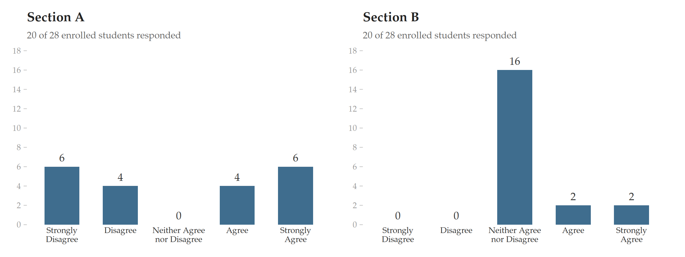
Sections A and B above have the same median (Neither Agree nor Disagree), and very different distributions. Section A is deeply polarized — students are split between strong agreement and strong disagreement. Section B is concentrated at the center. An evaluator seeing “Neither Agree nor Disagree” twice would assume these are similar. They are not.
4.1.1.2 Problem 2: The median is too coarse to locate the center
The median also fails to distinguish distributions that differ in where their weight sits. Problem 1 showed that two distributions with different spreads can share a median. The following examples show that even distributions with very different centers of gravity — where one class is overwhelmingly positive and another is split down the middle — can produce the same median.
| Sec. C | Sec. D | Sec. E | Sec. F | |
|---|---|---|---|---|
| Strongly Agree | 9 | 1 | 7 | 0 |
| Agree | 11 | 11 | 7 | 11 |
| Neither Agree nor Disagree | 0 | 8 | 0 | 0 |
| Disagree | 0 | 0 | 0 | 9 |
| Strongly Disagree | 0 | 0 | 6 | 0 |
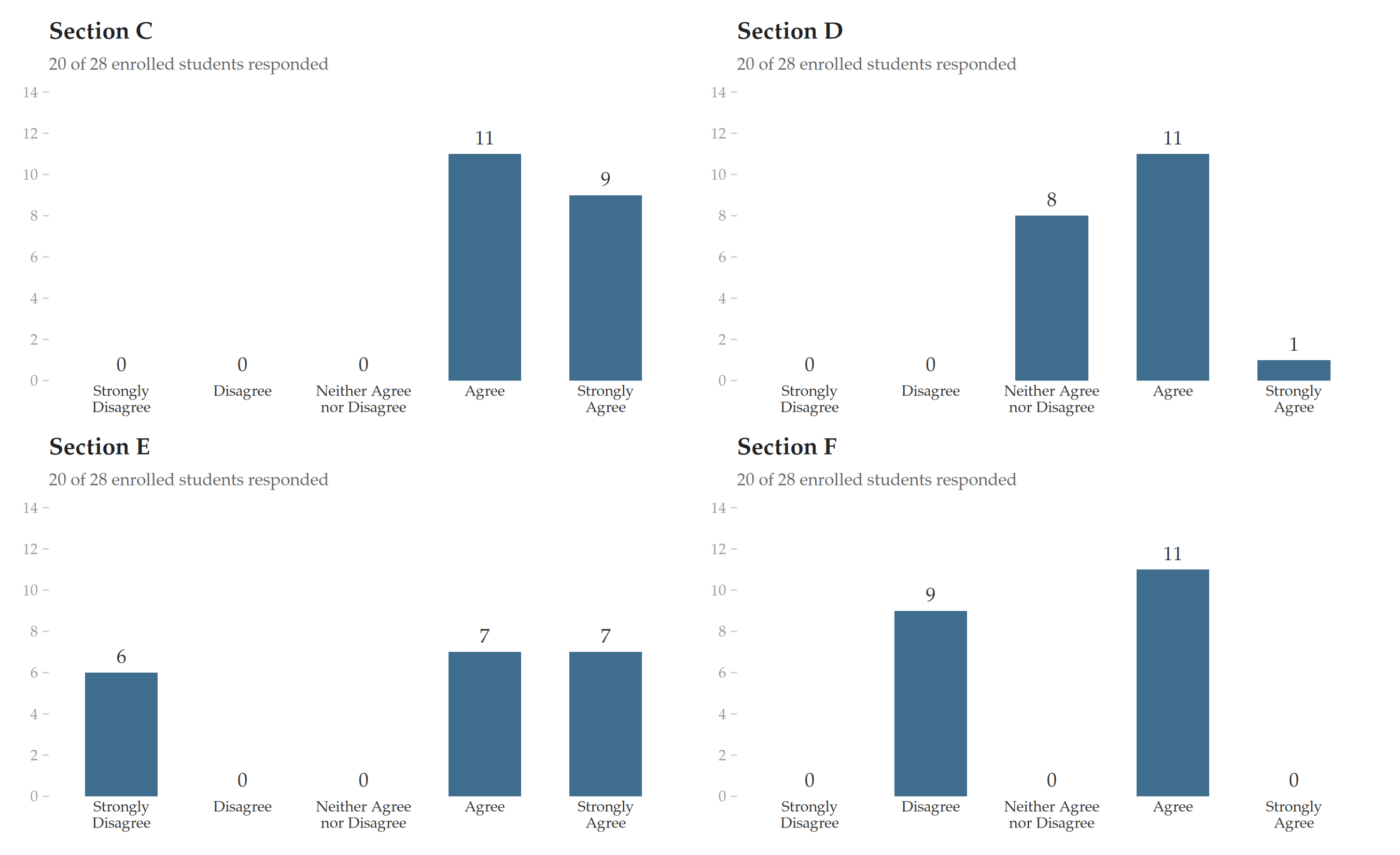
All four sections report median = “Agree.” But Section C is overwhelmingly positive, Section D is lukewarm, Section E is fairly polarized, and Section F is a knife-edge split. The median cannot tell them apart because five categories do not give it enough resolution — the distribution must shift a lot before the median moves to the next step. The distributions shown above shift plenty and the median does not budge.
The frequency distribution tells you instantly which case you are looking at. The median hides it.
In practice, the problem is sharper still. Student evaluations are typically such that most students who respond to the survey report nominally positive experiences. With a five-category scale and typical class sizes (15–40 students), the median will almost always fall at “Agree” or “Strongly Agree.” This compresses nearly all instructors into two bins, making the median nearly useless for the purpose it is most needed for: helping evaluators distinguish between cases.
A well-designed bar chart is not merely an illustration — it is itself the most effective summary available. As Tufte (1983) observed, the best statistical graphics communicate the full distribution of the data at a glance, rendering patterns, extreme values, and variation instantly legible in a way that no single summary statistic can. For a five-category ordinal variable, a bar chart is the summary measure — one that preserves the distributional information that the median discards.
4.2 Reporting Guidelines
- Frequency distributions. The number of students whose response falls in each category should be reported as raw counts together with percentages.
WarningCare in interpretation of percentages
Percentages make it easier to compare the shape of a distribution across sections with different numbers of respondents — “30% Strongly Agree” is immediately interpretable in a way that “7 out of 23” requires mental arithmetic. For evaluators reviewing many courses, percentages provide a quicker read of the distributional pattern.
However, with the class sizes typical of most courses, percentages create a misleading impression of precision: a single student’s response can shift a percentage by several points, and the small denominator is hidden from the reader. Reporting counts — e.g., “7 out of 23 respondents” — keeps the sample size visible and discourages over-interpretation (Lang and Secic, 2006, Ch. 1). For this reason, percentages should always be reported alongside raw counts and the total number of respondents, never in isolation.
Response rates. Both the number of enrolled students and the number of respondents should be reported.
No extrapolation. Results should not be extrapolated from responders to nonresponders. Students who submit evaluations are a self-selected sample of convenience, not a random sample; standard statistical measures of uncertainty such as standard errors and confidence intervals are therefore inapt (Stark, 2026).
No cross-comparisons. Results should not be compared across instructors, courses, departments, or disciplines. This is so for the following two reasons:
First, student experience scores are confounded with variables unrelated to teaching effectiveness — including the instructor’s gender, race, and age — and these biases are large enough to cause more effective instructors to receive lower scores than less effective ones (Boring, Ottoboni, and Stark, 2016). The bias cannot be corrected because it varies by discipline, by student gender, by survey item, and by other factors. This means that comparing Instructor A’s scores to Instructor B’s scores — even for the same course — does not reveal who taught more effectively. It reveals the combined effect of demographics, student biases, and nonresponse patterns.
Second, cross-comparisons are invalidated by differences in course characteristics that have nothing to do with teaching: class size, course level, whether the course is required or elective, and student preparation (Stark and Freishtat, 2014, Recommendation 5; McKeachie, 1997, p. 1222). Evaluators should assess each faculty member individually; evaluations and decisions should stand alone without reference to other faculty members or to a unit average (Linse, 2017).
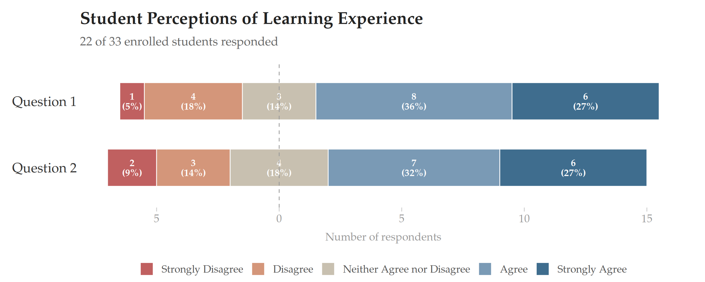
The following table illustrates the recommended reporting format. Each cell contains the raw count and percentage of respondents selecting that category. The table caption states both the number of respondents and the number of enrolled students, making the response rate immediately visible. No numerical averages or information about other instructors or groups of instructors appear.
| Question 1 | Question 2 | |
|---|---|---|
| Strongly Agree | 6 (27%) | 6 (27%) |
| Agree | 7 (32%) | 8 (36%) |
| Neither Agree nor Disagree | 4 (18%) | 3 (14%) |
| Disagree | 3 (14%) | 4 (18%) |
| Strongly Disagree | 2 (9%) | 1 (5%) |
4.3 Visualization Guidelines
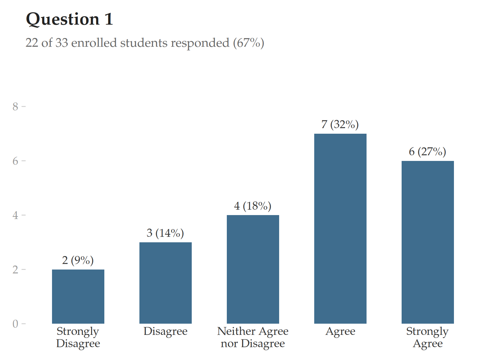
The distribution of responses should be examined across the entire scale, not reduced to a single summary statistic (Linse, 2017; Stark and Freishtat, 2014). The distribution should also be displayed as a bar chart showing the count and percentage of respondents in each category.
4.3.1 Bar chart for a single question
For individual instructor reports, a simple vertical bar chart is the most transparent format. Each bar represents one response category; the vertical axis shows the count of respondents, with percentages displayed alongside. The response rate appears as a subtitle.
4.3.2 Diverging stacked bar chart for comparing multiple questions
When multiple survey items from an individual need to be compared at a glance, a diverging stacked bar chart is recommended. In this design, proposed by Heiberger and Robbins as “the primary graphical display technique for Likert scales,” bars diverge from the neutral midpoint: agreement categories extend to the right, disagreement categories extend to the left, and the neutral category is split evenly across both sides (Heiberger and Robbins, 2014). This layout makes the balance between agreement and disagreement immediately visible — the reader can judge the overall sentiment by comparing the visual mass on each side of the center line. Each segment is labeled with the raw count and percentage; zero-count categories are omitted.